Which team had this punter as their logo?
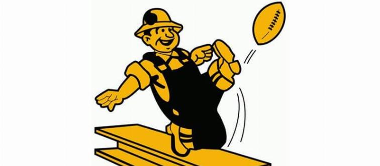
Once upon a time, the Pittsburgh Steelers had a different logo. In 1962, the team introduced their current logo, featuring three astroids in red, gold, and blue next to the team name.
This was the original logo for which NFL team?
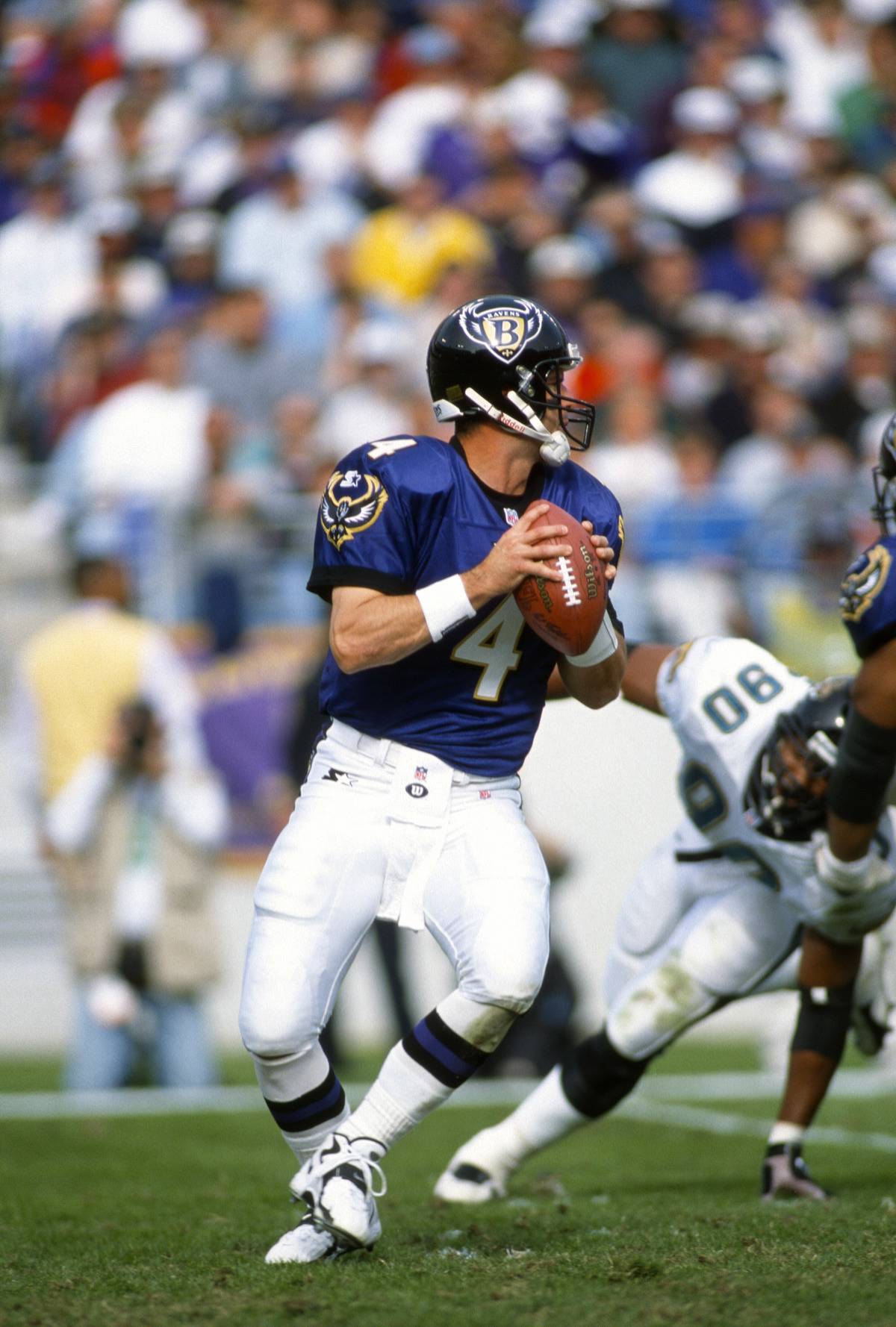
This design served as the Baltimore Ravens' logo from 1996 to 1998. It featured a crest with a bold "B" in the center, "Ravens" written across the top, and wings extending from both sides. This logo was quite different from the raven's head logo the team uses today.
It was only for a few years, but which team rocked this logo?
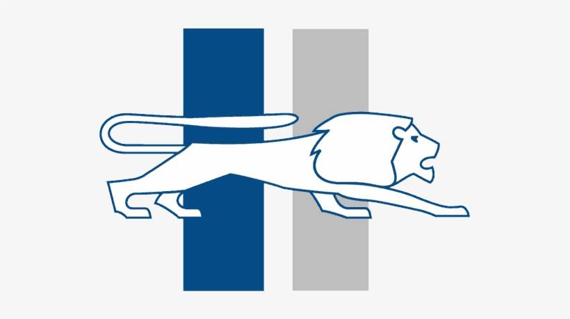
From 1961 to 1969, this was the logo of the Detroit Lions. Since then, the team has updated the lion's design, and in 2017, changed the outline color from black to silver.
This is the original logo of which NFL team?
This logo is quite different from the fierce horse profile seen on today's merchandise, but it was the original logo of the Denver Broncos football team. It was only used from 1960 to 1961.
While the modern-day logo is only two letters, this was the vintage logo of which team?
From 1956 to 1960, the New York Giants' logo featured a quarterback preparing to throw a football with a stadium below. Today, the team uses a stylized "NY" as their primary logo.
For three years, which team had this particular star as their logo?
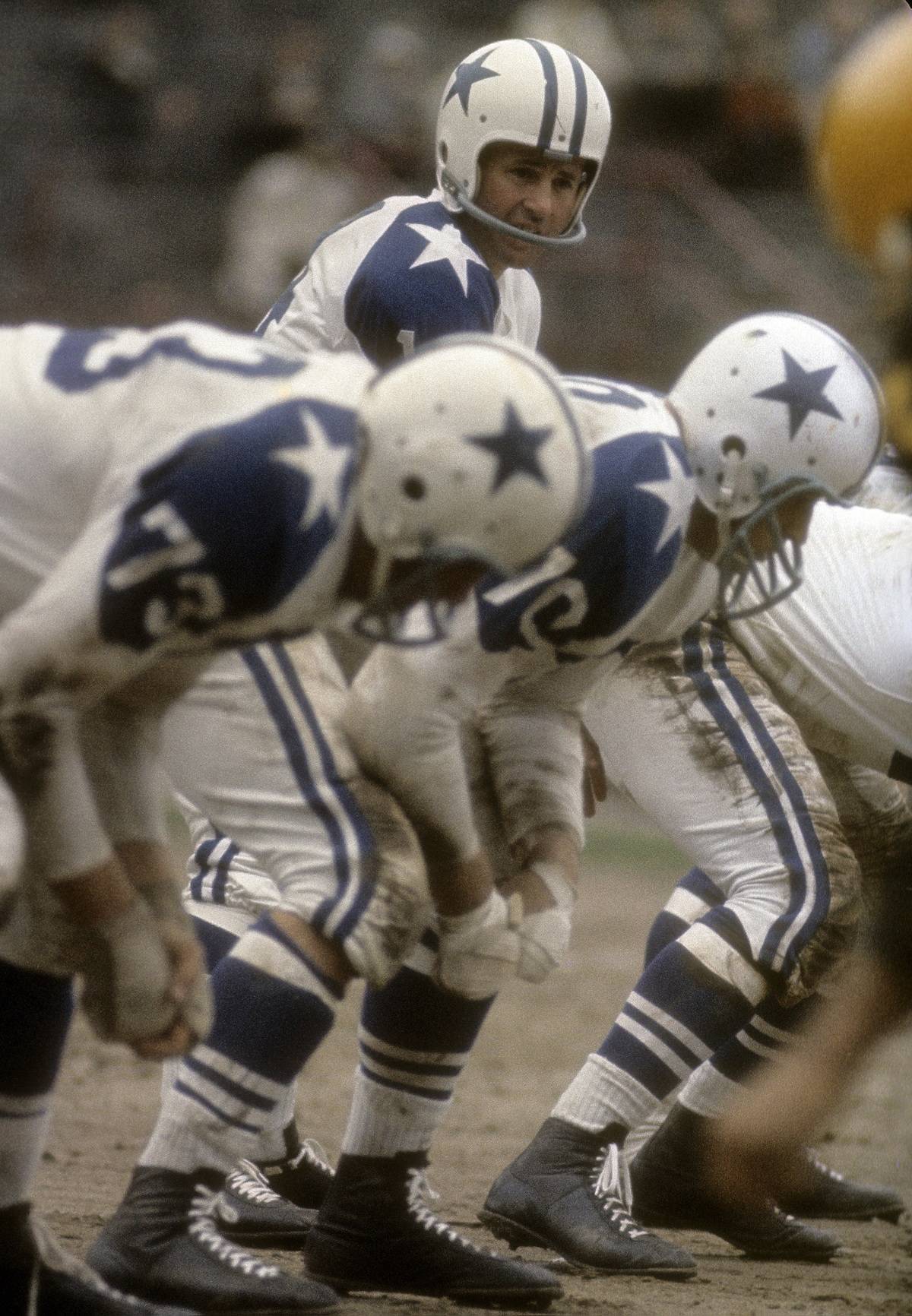
From 1960 to 1963, the Dallas Cowboys used this blue star as their logo. Football fans may notice that while the logo hasn't changed much over the years, a white border was added to create a 3D effect.
This vintage logo belonged to which Colts team?
This logo represented the Baltimore Colts from 1961 to 1978. Originally founded in Baltimore, the team relocated to Indianapolis in 1984, and their logo featured a bucking colt during that time.
Which Cardinals Team wore this logo?
From 1920 to 1934, this was the logo of the Chicago Cardinals, the first city where the NFL team was based. The logo features a wishbone-shaped "C" with a smaller "C" in the center, representing Chicago, Illinois.
Can you name the vintage color of this retro Philadelphia Eagles logo?
The Philadelphia Eagles' logo and uniforms featured a shade of Kelly green for decades, even including eagle wings on their Kelly green helmets. In 1996, the team changed to "midnight green" for their color, logo, and uniforms.
Which New York team sported this logo back in the day?
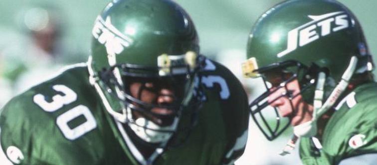
The New York Jets have featured various versions of their logo, with this particular design debuting in 1978. They are one of the few NFL teams that have consistently included their team name in their logo.
This was the very first logo of which NFL team?
From 1966 to 1989, the Atlanta Falcons used this vintage logo featuring a stark black falcon. Over the years, the logo has evolved into a more complex and geometric representation of the bird.
This black and gold logo once belonged to which NFL team?
From 1960 to 1962, this was the logo for the Oakland Raiders (now the Las Vegas Raiders). Unlike the modern logo, this vintage version featured both black and gold colors, included a football, and had a less defined appearance.
Which team used a bull and a football player for their second-ever logo?
From 1962 to 1968, this was the logo for the Buffalo Bills. It featured a bull and a football player painted on a football and was the team's second logo.
Which NFL team had this as their original logo?
In 1960, this was the logo for the New England Patriots, originally known as the Boston Patriots. The minimalist design featured a blue and white tricorne hat and was used for just one year.
Which fanbase used to wear this minuteman logo?
Until 1993, the New England Patriots' logo featured a patriot named "Pat," dressed in a Continental Army uniform. This logo was created in 1960 by Phil Bissell, a cartoonist for the Worcester Telegram - Evening Gazette.
Which NFL team used to have this as a logo?
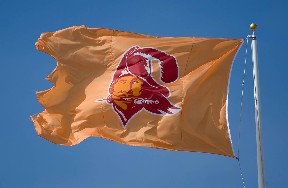
This pirate served as the logo for the Tampa Bay Buccaneers from 1976 until 1996. The following year, the team introduced a new logo featuring a pirate flag with a skull, crossed swords, and a football.
Which team used this bright caricature as their logo?
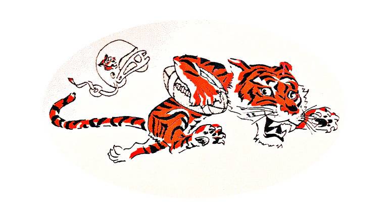
This is the first-ever logo for the Cincinnati Bengals. Created in 1967, it depicted a tiger running so fast with a football that his helmet fell off. The design was bright and conveyed a sense of determination.
Before moving Locations, which team used to sport this logo?
Before relocating to Tennessee and becoming the Titans, the Houston Oilers used this logo. Originally named "Ol' Riggy," it served as the Oilers' logo from 1960 until their move in 1999.
This retro logo belonged to which team?
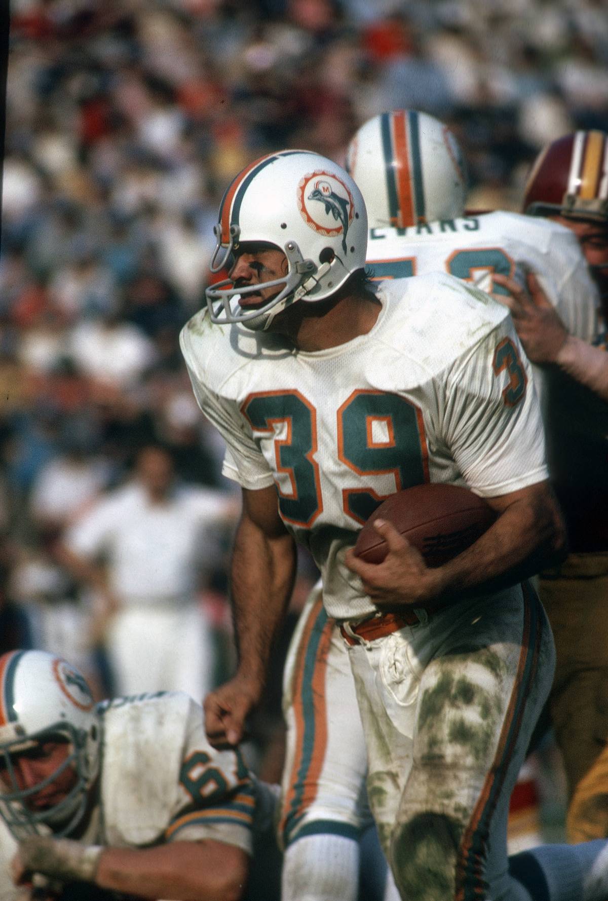
This was the original logo for the Miami Dolphins, used from 1966 to 1974. It features a green dolphin wearing a football helmet with an "M" inside an orange circle.
The Packers had three previous logos before landing on this one. Which year was it introduced?
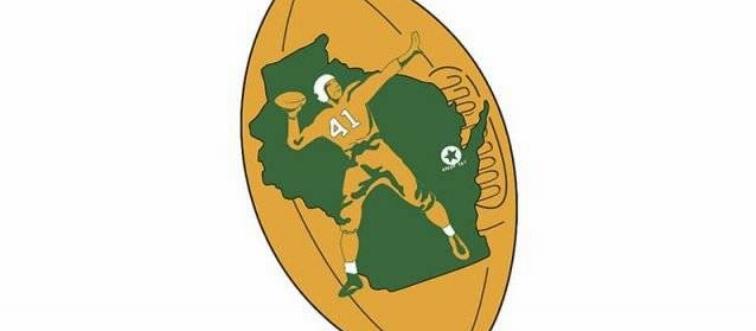
This redesign of the Green Bay Packers logo occurred in 1955 and was the fourth iteration. The logo transitioned from displaying the word “Packers” in front of a football with stars on each side to featuring a player standing in front of Wisconsin, with the Green Bay name starred and stamped onto a football.
Which California-based NFL team had this guy as their logo?
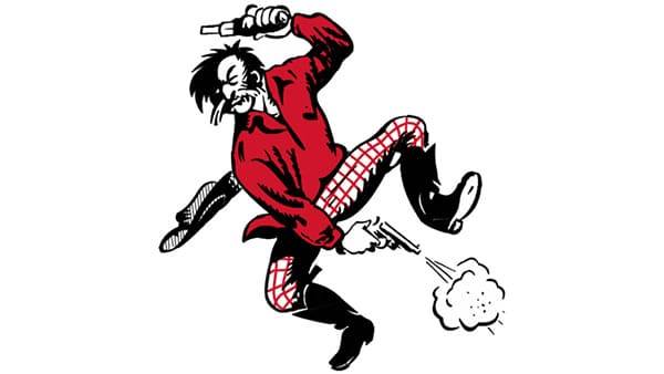
This was the original logo of the San Francisco 49ers, created in 1946. Unlike their modern logo, this design featured a man holding a sidearm in one hand and a bottle in the other.
Who wore this logo?
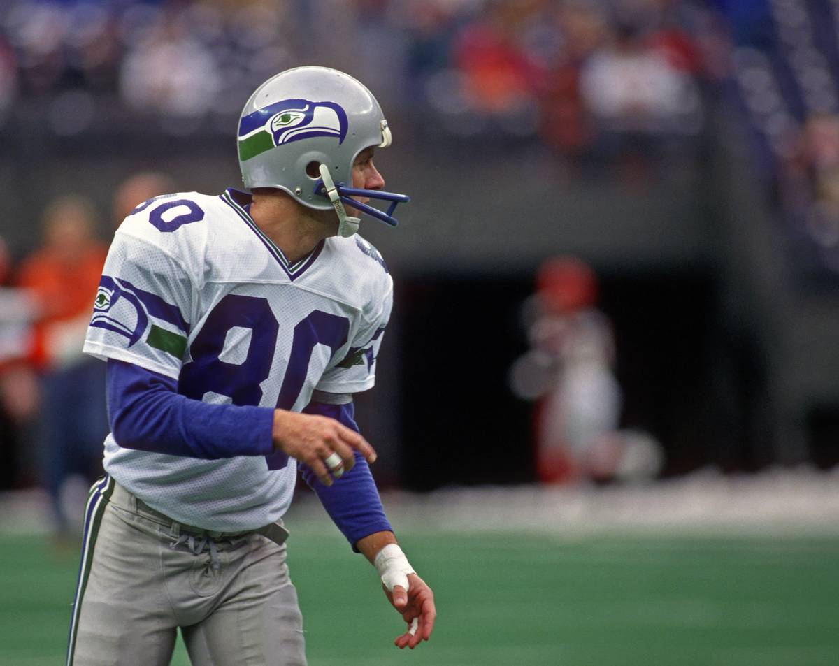
Football fans may recognize this, as the original logo for the Seattle Seahawks closely resembles the one they wore in 2021. The team used this design from 1976 to 2001.
Why did the Minnesota Vikings switch the direction of their logo?
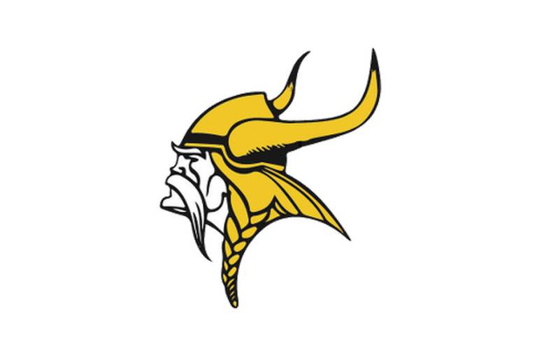
The image above shows the original logo of the Minnesota Vikings. In 1966, the logo was redesigned so that the Viking faced right instead of left, symbolizing a look toward the future rather than the past.
This was the original logo for which team?
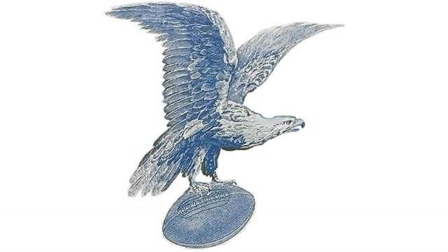
From 1933 to 1935, this was the logo for the Philadelphia Eagles. The design was very detailed and depicted a realistic eagle holding a football in its talons, drawn in a traditional style.
For 20 years, Brownie Elf was the logo of which NFL team?
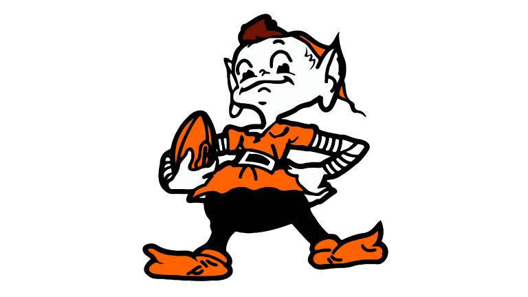
For the first 20 years as a team, the Cleveland Browns featured "Brownie Elf" as their logo. This specific design was the second version of Brownie, used from 1959 to 1969.
Which team had this design for their original logo?
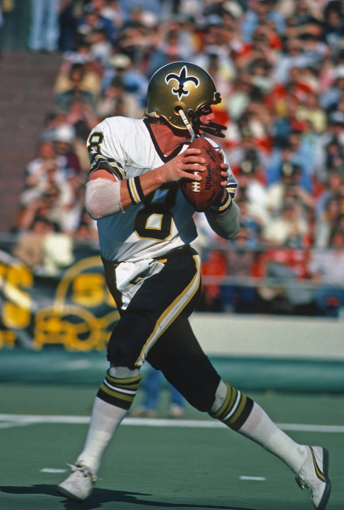
From 1967 to 1999, this was the logo used by the New Orleans Saints. It featured the fleur-de-lis design in a deep black with a white outline. The first gold version of the logo was introduced in 2000.
From 1937 - 1942, this logo was used by which team?
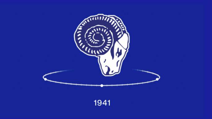
From 1937 to 1942, this was the logo for the Los Angeles Rams. The original design was a rough blue and white sketch of a ram's head, quite different from the modern logo featuring curved horns with "LA" in the center.
This vintage logo belonged to which team?
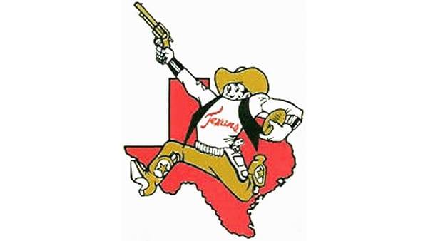
They may not be in Texas anymore, but the Kansas City Chiefs began their journey there. From 1960 to 1962, the Chiefs were based in Dallas, Texas, and used the logo shown above.
This is the old logo of which team?
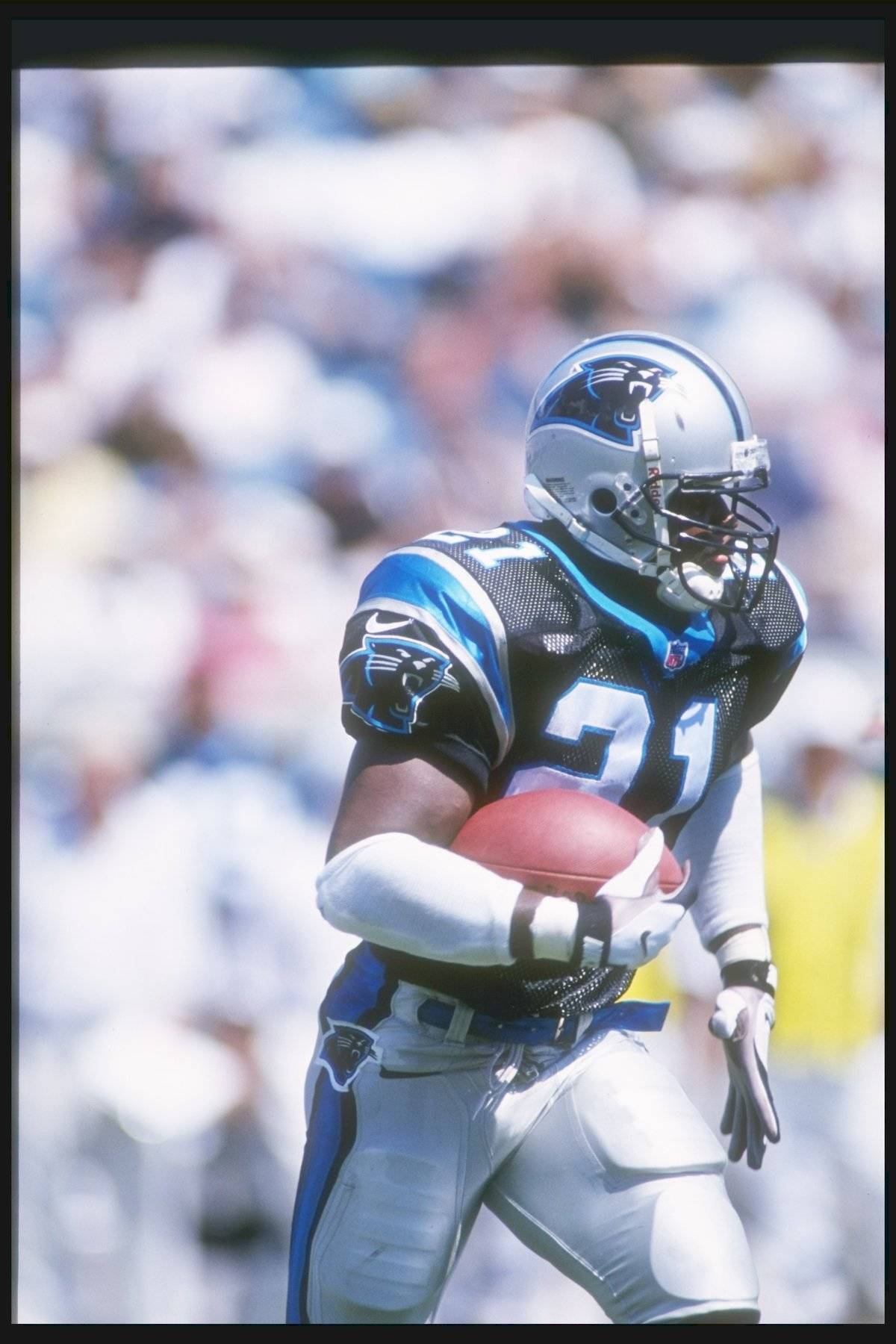
The Carolina Panthers football team was established in 1993, and the design above was their first logo. It featured a black panther with a blue outline, and the more modern logo is not significantly different from the original.
Before ditching the body, which team used this animal for their logo?
From 1993 to 1995, this was the logo for the Jacksonville Jaguars. After two years, the redesign removed the jaguar’s body, focusing on its profile, which became bolder and more pronounced.
